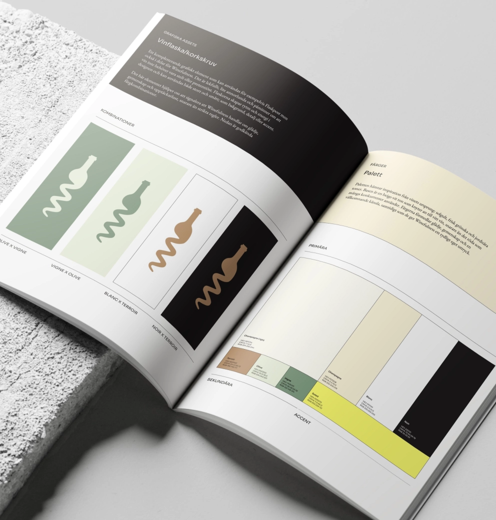
For Winefulness we took a holistic approach to brand identity and digital presence, with the aim of creating a clear and cohesive platform for courses, tastings and membership.
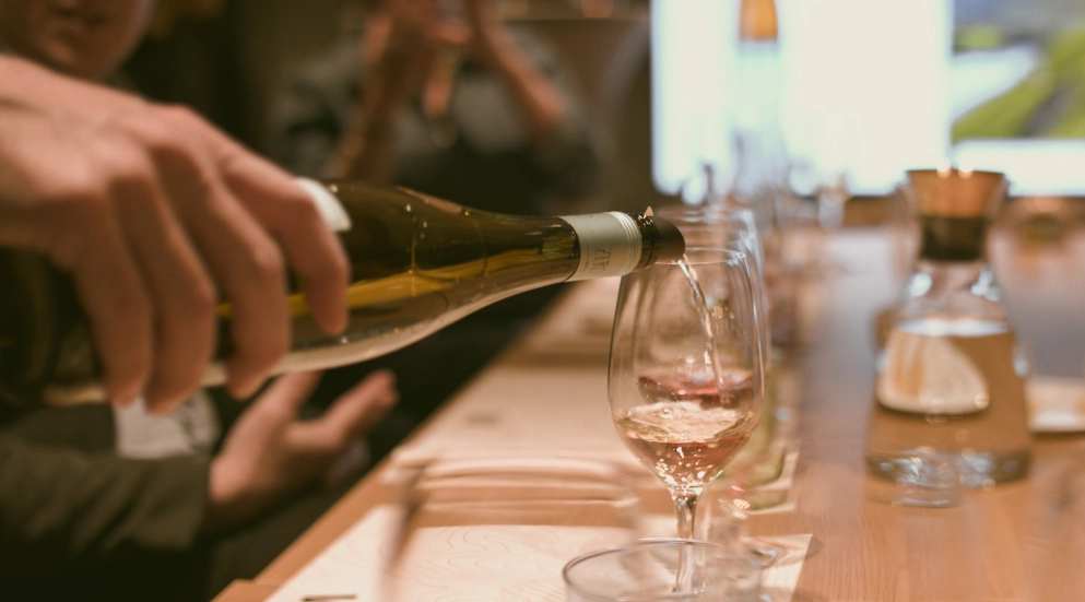
Based on passion, knowledge and community, we developed an identity that moves away from the more traditional expressions of the wine world. The visual direction draws inspiration from the origins of wine – soil, greenery and light – and creates an open, contemporary and inviting expression that reflects how Winefulness wants to be experienced in every encounter.

The project began by defining tone and communicative direction together with Winefulness.
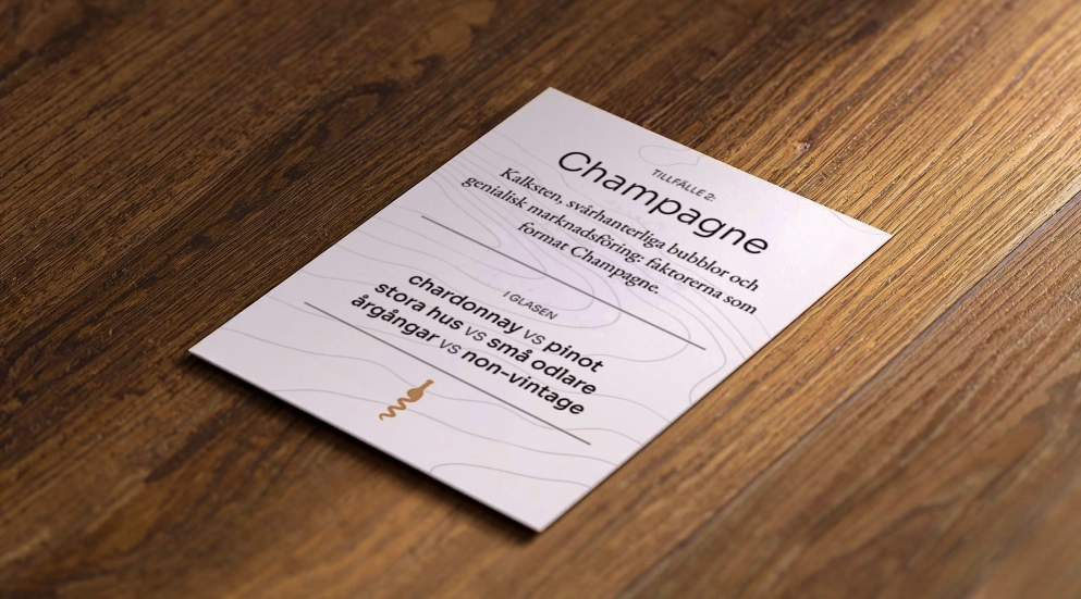
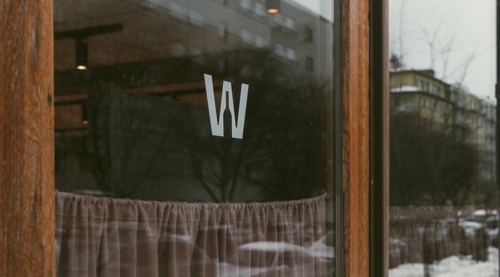
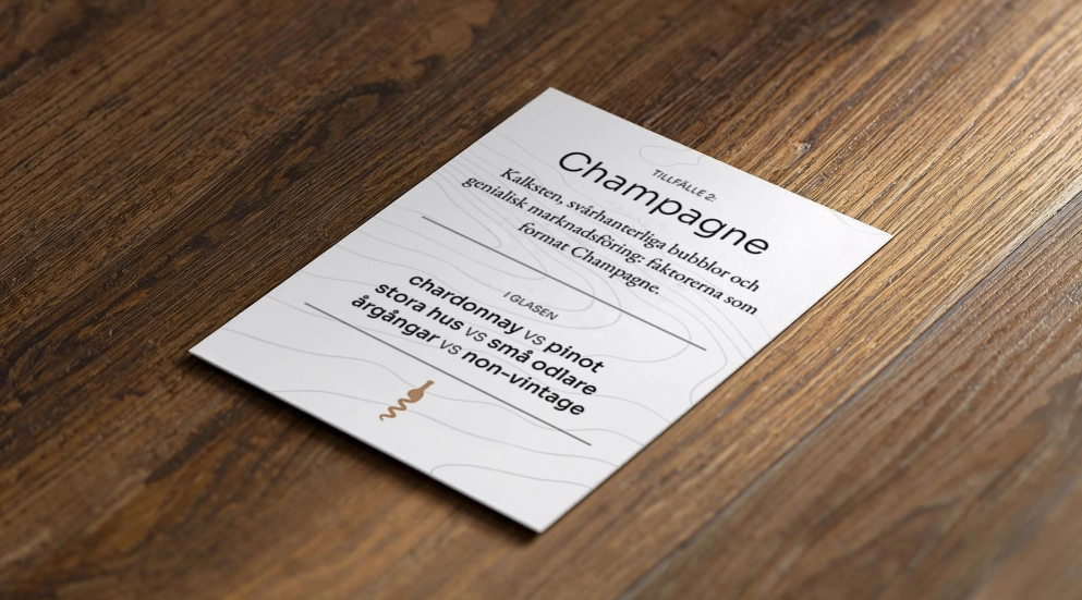
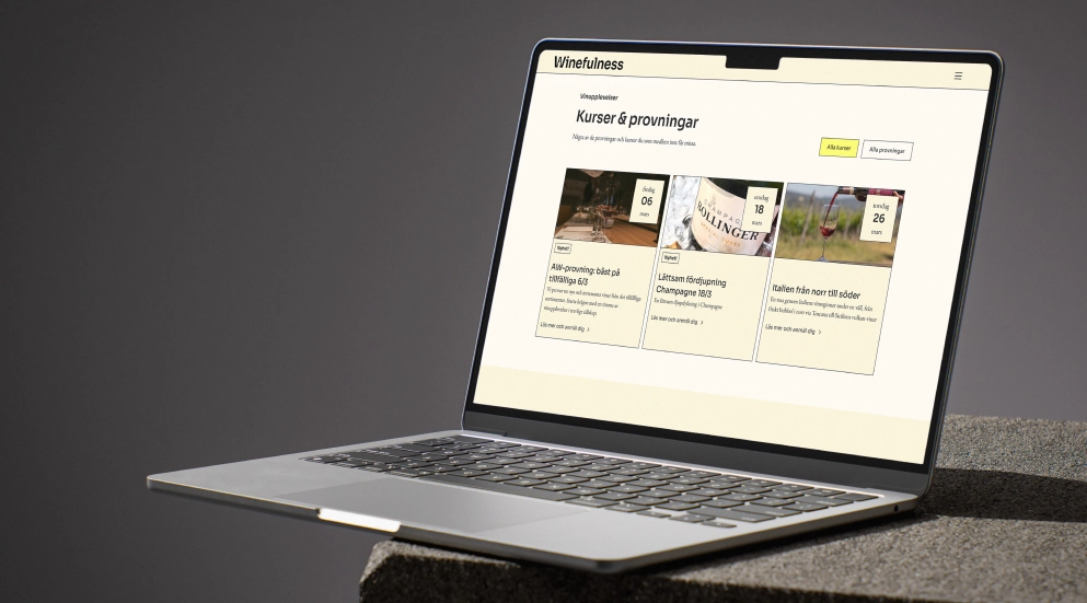
A clear communicative foundation was formulated, with a warm, curious and knowledgeable voice as the base. Based on this, a visual identity was developed to ensure consistency across all channels, from printed material to digital platforms. In parallel, a new website was created with a clear structure for courses, tastings and membership, with the user experience at the centre.
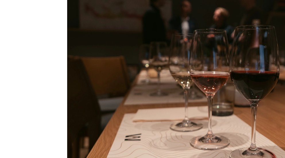
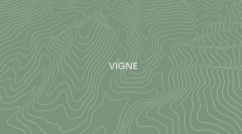
A graphic pattern was also developed, based on topographic maps of selected vineyards, which strengthens the link to the unique conditions of each place.
Winefulness now has a cohesive identity that works just as strongly at physical encounters as it does digitally. The identity is clear, personal and professional, and the website and accompanying newsletter are structured to make it easy to discover the offer, book tastings and follow upcoming activities.
The clear direction positions Winefulness as a contemporary alternative in the wine world, where knowledge and community have room to exist without feeling closed or inaccessible. With a well-developed visual platform and consistent tone, the conditions for long-term growth are in place.